
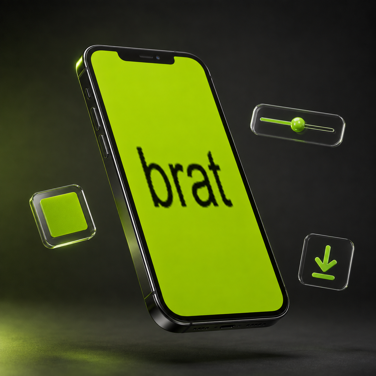
The neon-green, smudged-lowercase look that took over feeds in 2024 didn’t stay a Charli XCX album cover for long. Within weeks it was profile pictures, birthday posts, breakup captions, and inside jokes – anyone with a phone and a spare minute could make one. That’s the part that made it spread the way it did: the barrier to entry was basically zero.
If you’ve read about where the brat aesthetic came from and want to make one yourself instead of just admiring other people’s, here’s the honest, no-fluff version of how it’s done – no Photoshop, no tutorials to sit through, no account to create.
What You Actually Need
A browser. That’s genuinely the whole list. The tools that fuel this trend run entirely in your browser tab, so there’s nothing to download and no software license standing between you and a finished image.
The Five-Step Version
1. Open a browser-based generator built for the look, rather than a general design app you’d have to configure yourself.
2. Type your word or short phrase. One strong word almost always reads better than a full sentence – if you’re stuck, a running list of 100 brat words sorted by mood is worth keeping open in another tab.
3. Set the background. The real color is a specific, slightly aggressive lime green, not a generic “green” swatch – most tools default to it, but it’s worth double-checking against the actual hex value if you’re building the look from scratch.
4. Adjust the blur and skew together. The original cover’s text isn’t crisp – it’s got a soft, slightly out-of-focus quality that a single “chaos” or distortion slider handles in one move instead of three separate settings.
5. Download. PNG for most uses, and a transparent export if the graphic is going over a photo instead of standing alone.
The Detail Most People Skip
The font matters more than people assume. The lowercase, condensed typeface is doing a lot of the visual work – swap it for a bold or heavy font and the result reads as a different style entirely, even with the right color and blur in place. It’s a small setting, but it’s the difference between something that looks intentionally brat and something that just looks like green text.
Where People Actually Use These
Profile pictures are the most common use by a wide margin, since a single bold word reads clearly even shrunk down to avatar size. After that: story graphics, meme captions where the font is doing half the joke, and quick status updates that would otherwise just be plain text.
The tools behind most of this are simpler than they look. A free browser-based brat generator typically has the color, font, and blur set correctly as defaults, so there’s nothing to configure before you start typing – you’re not fighting the tool to get the look right, which is a big part of why this trend was so easy for so many people to jump into at once.
If you’ve got a word in mind already, that’s all you need to start. If not, browsing a list of a hundred brat words and phrases – sorted by mood, from confident and loud to quieter and more personal – is usually faster than staring at a blank text box trying to think of one.
Either way, the whole process – typing, styling, downloading – takes less time than it took to read this article. That’s the actual reason the aesthetic spread as fast as it did: once someone tries a brat word generator once and sees how little effort it takes, making the next one is an easy habit to fall into.
